Key Takeaways
- Clear, readable typography in AI-generated images directly affects perceived professionalism and audience trust.
- Consistent font choices, hierarchy, and contrast help text remain legible across platforms and image styles.
- General AI image tools often struggle with accurate, repeatable text-in-image results at scale.
- Specialized platforms improve likeness, consistency, and workflow for creators who monetize visual content.
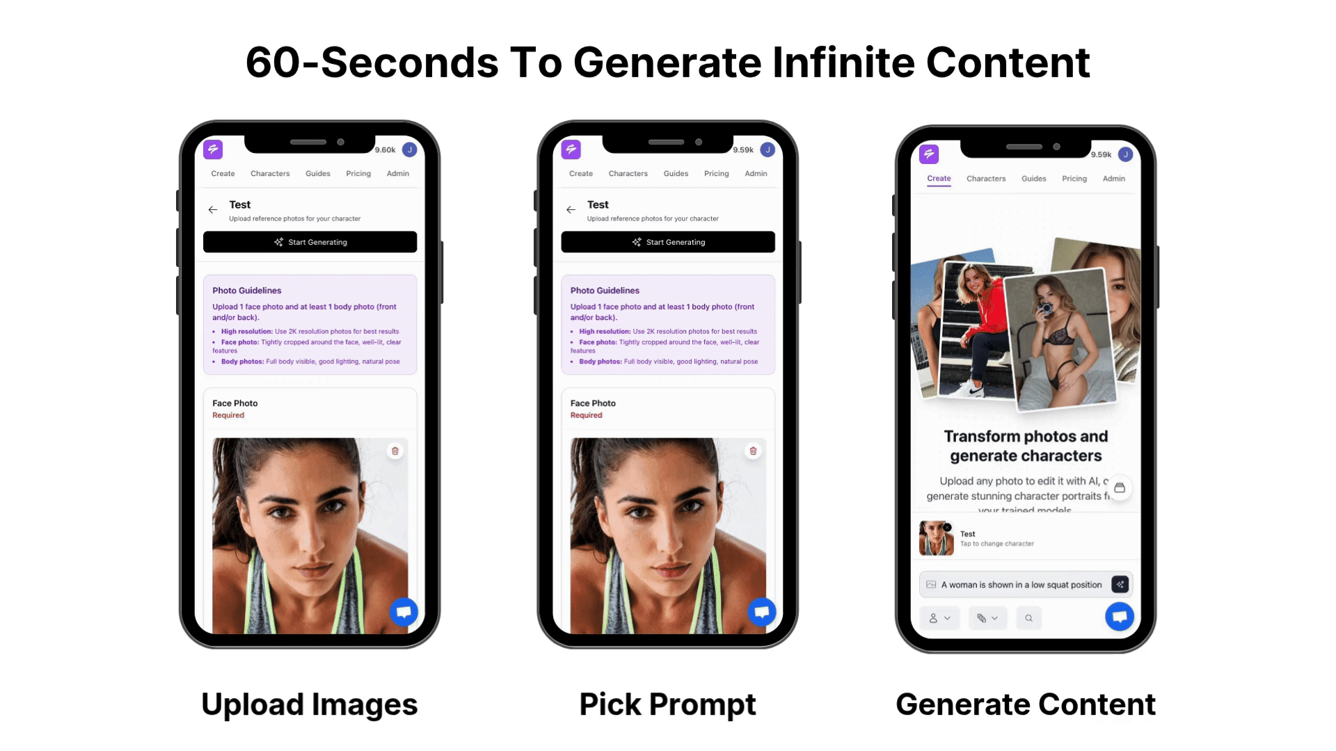
- Sozee helps creators generate hyper-realistic, monetizable content efficiently; sign up to start creating with Sozee.
Understanding the Challenge: Why Text in AI Images is So Hard
AI image generators handle shapes and textures well but often misinterpret text. Most models treat letters as visual patterns, not language, which causes issues with spacing, legibility, and character accuracy.
Poorly integrated text can detract from the professionalism of your AI-generated images, impacting viewer engagement. Distorted or off-brand text weakens credibility and reduces effectiveness in commercial campaigns where clarity and trust matter.
Specialized tools now focus on these typography gaps. These platforms prioritize structured content creation and brand consistency rather than treating text as a minor visual detail.
The Creator’s Dilemma: Balancing Volume and Quality
The demand for content outstrips supply by an estimated 100 to 1, creating a structural imbalance we call The Content Crisis. Creators must publish often while still protecting visual identity and message clarity.
Manual text overlays can ensure accuracy but slow down production. Relying on AI-generated text alone often produces unreadable words. A practical approach combines solid typography principles with tools that respect brand standards and support repeatable workflows.
Core Principles of Typography for Effective Image Integration
Strong typography in AI images starts with readability. Viewers should be able to understand the message at a glance, even on small mobile screens.
- Legibility and contrast: Use colors that clearly separate text from the background and avoid busy areas that compete with the message.
- Hierarchy: Make key text, such as headlines or offers, larger or bolder than supporting details so the eye knows where to go first.
- Alignment and spacing: Keep line spacing, margins, and alignment consistent across images to create a cohesive set.
- Tone and emotion: Sans-serif fonts feel modern and clean, serif fonts signal tradition or authority, and scripts add personality but can be harder to read.
Selecting the Right Font: Impact on Hyper-Realistic AI Images
Font choice affects both brand tone and AI render quality. Simple, bold sans-serif fonts such as Arial, Helvetica, or Montserrat usually survive AI generation better than thin, decorative, or complex scripts.
Fonts with clear letter shapes and generous spacing help reduce distortions and overlapping characters. Testing how a font looks at different sizes ensures readability for feeds, thumbnails, and larger formats.
Creators who limit themselves to a small, reliable font palette of two or three families usually see better consistency across entire content libraries.
Text Integration Techniques with General AI Image Generators (e.g., Krea.AI)
Many creators start by generating a clean base image with tools like Krea.AI, then add text later in a design tool. This two-step method provides control over fonts and placement but adds extra time to every asset.
Another option is to include text instructions in prompts, such as “poster with headline text: Summer Sale.” This can work for simple phrases, but results often vary and require multiple attempts.
Most workflows with general tools involve iteration. Creators generate several options, discard images with broken text, and refine prompts until they reach an acceptable result, which can limit scalability for high-volume publishing.
Limitations of General AI Tools for Text-in-Image Generation
General models interpret text as shapes, so they frequently generate misspelled words, uneven spacing, or random characters. This makes them unreliable for branded content where accuracy is essential.
Consistency across a series of images is another challenge. Even if one image looks acceptable, the next output may change letter style, size, or alignment, which disrupts cohesive campaigns.
For creators and agencies that need many images each week, the manual cleanup these tools require can reduce the value of automation.
Sozee.ai vs. General AI: A Comparison for Hyper-Realistic Content Creation
Creators who depend on content for revenue benefit from tools that are built around likeness accuracy, brand consistency, and monetization workflows rather than general image exploration.
|
Feature |
General AI (e.g., Krea.AI) |
Sozee.ai |
|
Output Quality |
Quality varies by prompt and model settings |
Hyper-realistic output tuned for creator likeness |
|
Consistency Across Generations |
Inconsistent styling across images |
Content sets built for brand and style consistency |
|
Ease of Use |
Multi-step workflows and manual edits are common |
Streamlined setup from as few as 3 photos |
|
Monetization Workflow Support |
Not always optimized for creator income streams |
Features aligned with platforms like OnlyFans, Fansly, TikTok, Instagram, and X |
Advanced Strategies for Hyper-Realistic Content with Sozee.ai
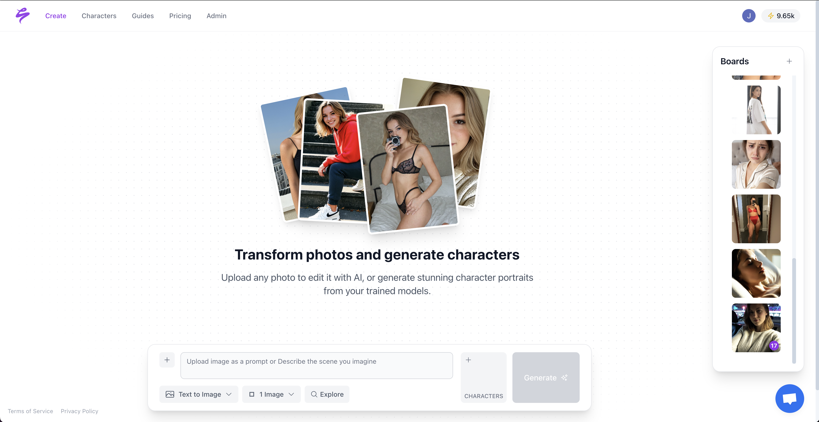
Sozee.ai focuses on the needs of professional creators who monetize their image-based content. The platform is structured around likeness accuracy, repeatable quality, and fast production.
Key capabilities include:
- Hyper-realistic likeness recreation that builds a consistent visual model from a small set of reference photos.
- Brand-consistent image sets that maintain lighting, styling, and framing across entire campaigns.
- Refine tools that let you adjust skin tone, lighting, and angles without advanced design skills.
- A curated prompt library that provides tested concepts, reducing guesswork and iteration.
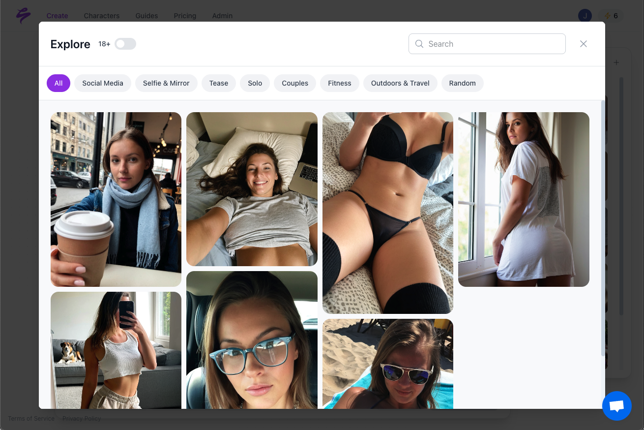
- Outputs prepared for monetization on major creator platforms, with sizing and framing that support engagement and conversion.
Create hyper-realistic, monetizable content with Sozee.
Overcoming Common Challenges & Troubleshooting for Text in AI Images
Unreadable or “gibberish” text often results from vague prompts or asking general tools to handle detailed wording. Clear instructions, shorter phrases, and simpler fonts usually improve outcomes.
Font and style drift across a series can weaken brand recognition. Consistent prompt templates, a fixed font palette, and creator-focused platforms that support repeatable looks help maintain coherence.
Poor placement or sizing makes even accurate text hard to read. Describing layout in prompts, such as “headline centered at top” or “small caption in lower-right corner,” guides composition and reduces awkward positioning.
Blur and distortion signal resolution limits or aggressive upscaling. Higher base resolutions and tools designed for clear outputs at multiple sizes, such as Sozee.ai, support better results for both social feeds and paywalled platforms.
Conclusion: Mastering Your Message with AI-Powered Visuals
Clear, consistent text in AI-generated images strengthens brand perception and supports higher-performing campaigns. Creators who link strong typography with structured workflows can scale output without lowering quality.
General AI tools are valuable for experimentation but often fall short when projects demand accurate, repeatable, text-integrated visuals at volume. Manual fixes add friction and limit how fast creators can publish.
Sozee.ai addresses these gaps by focusing on likeness accuracy, consistency, and monetization needs. The platform helps creators build image libraries that look professional, align with brand standards, and support revenue goals.
Sign up for Sozee to streamline hyper-realistic content creation.
Frequently Asked Questions (FAQ) about Typography and Text in AI Images
How accurate is AI in generating English text within images?
Accuracy depends heavily on the platform. Many general image generators produce misspellings, broken letters, or random characters that require editing before use. Creator-focused platforms like Sozee.ai emphasize stable, high-quality outputs across multiple generations, which makes them better suited for commercial content.
Can AI assist in choosing the best typography for my brand’s images?
Some AI tools can suggest font pairings, colors, and layouts that align with a stated brand style. This guidance can speed up decision-making, but long-term consistency still relies on clear brand rules and a limited, intentional font system.
What are the ethical considerations when using AI to integrate text into images, especially for commercial purposes?
Ethical use includes proper licensing of fonts, transparent disclosure of AI use when required by platforms, and respect for audience expectations. Creators should also consider privacy and control over likeness. Sozee.ai supports this by giving creators ownership over their models and keeping generated content within a controlled environment.
How does Sozee.ai ensure high-quality content compared to other AI image generators like Krea.AI?
Sozee.ai is built around monetizable creator workflows rather than general image prompts. The system uses likeness modeling from a small set of reference photos and applies consistent styling rules, which supports reliable, photorealistic output for entire series of images.
What technical specifications should I consider when planning text integration for AI-generated images?
Plan for the smallest screen first to keep text readable on mobile feeds. Choose colors with strong contrast, use simple fonts, and test typical post dimensions for platforms like Instagram, X, and TikTok. Document preferred font sizes, line spacing, and placement rules so prompts and tools can reproduce your style across all content.