Key Takeaways
- Color accuracy directly affects how real and trustworthy AI-generated content appears, which influences engagement and conversions.
- Well-tuned LoRA training parameters and curated datasets improve color stability across campaigns and platforms.
- Clear prompts, structured control techniques, and post-processing workflows help keep colors aligned with brand standards.
- Objective and perceptual metrics give creators a repeatable way to measure, compare, and refine color performance over time.
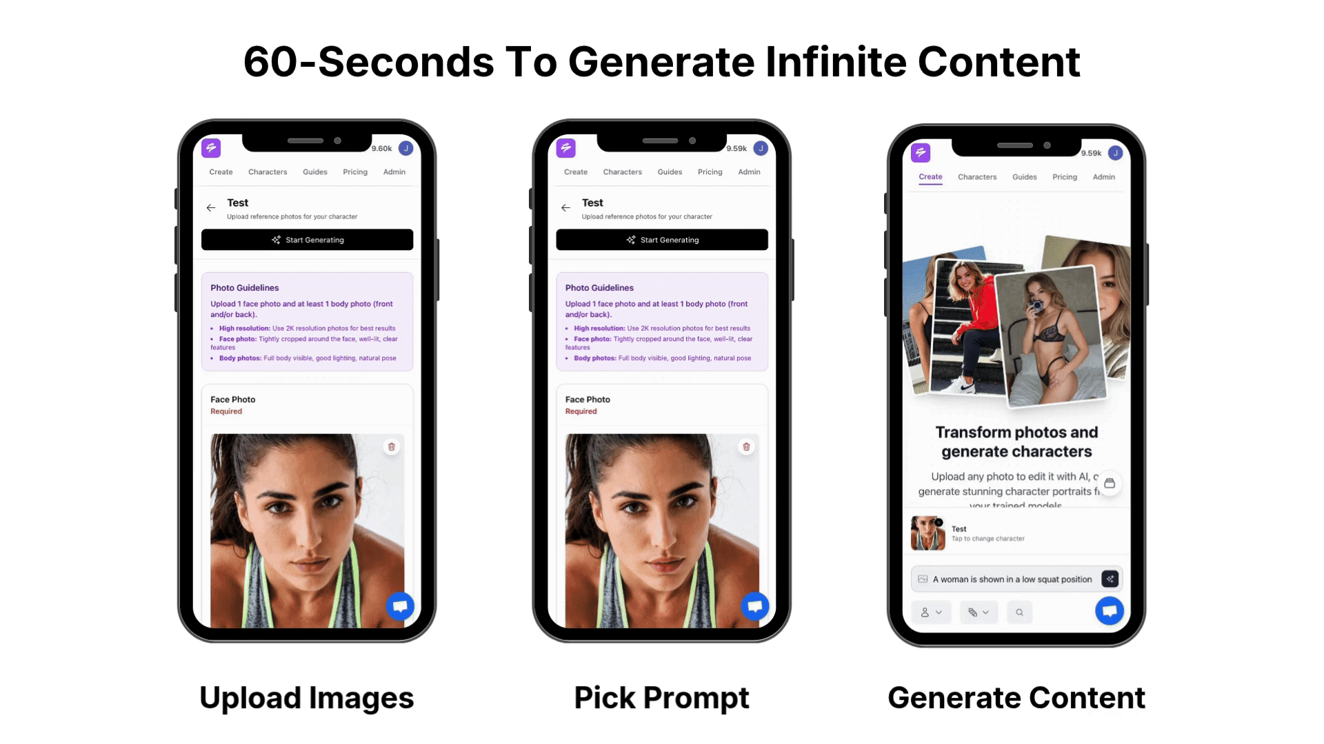
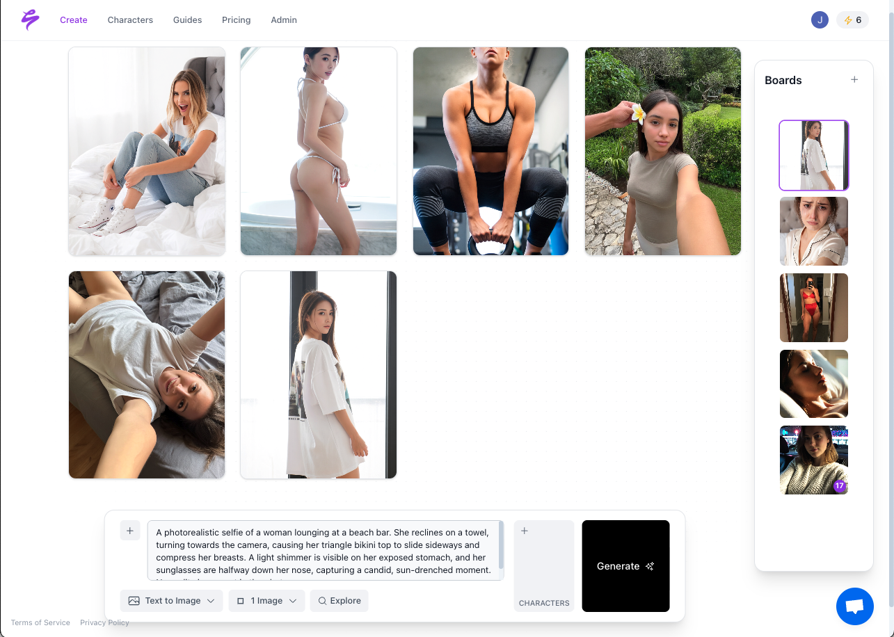
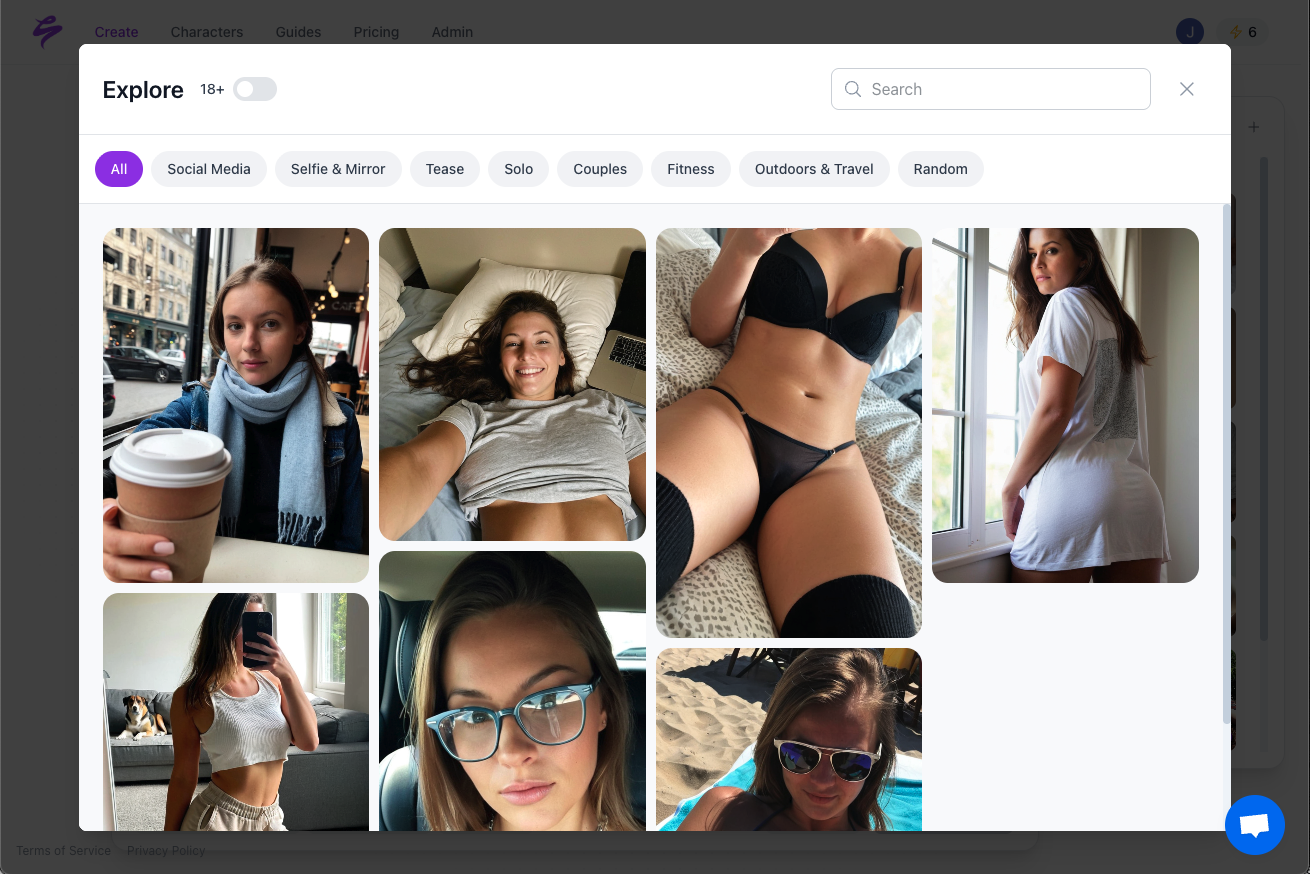
- Creators can use Sozee to generate photorealistic, brand-consistent content at scale, with simple onboarding at Sozee.
The Critical Role of Color in Photorealistic AI: Why it Matters for Your Brand & Bottom Line
Color accuracy shapes how audiences perceive authenticity in AI-generated content. Viewers notice color mismatches quickly, and visible artifacts make content feel artificial, which reduces trust and engagement.
Consistent palettes and stable skin tones support a recognizable visual identity across platforms like OnlyFans, Instagram, and TikTok. Virtual influencer teams depend on that consistency, because color shifts between posts can make entire campaigns feel off-brand and often unusable. Sozee provides a way to generate photorealistic content while keeping brand visuals consistent.
Strategy 1: Optimize LoRA Training Parameters for Reliable Color Fidelity
Fine-tuning LoRA Rank for Nuanced Color Capture
The LoRA rank parameter controls how well a model captures fine color details and subtle gradients. Higher ranks between 64 and 128 allow the model to encode more nuanced color relationships and usually improve fidelity, but they also demand careful training to avoid overfitting. For photorealistic content with brand-level accuracy, very low ranks often miss the color complexity needed.
Aligning Resolution and Aspect Ratios for Consistent Hues
Matched resolution and aspect ratios between training data and target outputs reduce color compression and banding. SDXL LoRAs train at 1024×1024 resolution, while SD 1.5 uses 512×512, so models often perform differently at higher resolutions that creators need for premium content. Consistent aspect ratios across your dataset help limit stretching artifacts that distort colors at the edges of frames.
Preventing Color Drift with Optimizers and Schedulers
Thoughtful optimizer and learning rate choices help keep colors stable across training epochs. Setups using AdamW 8bit with cosine warmup scheduling maintain steadier color behavior during fine-tuning. Poorly chosen repeats or excessive epochs often push results toward oversaturation, or wash images out so they lose photorealistic depth.
Strategy 2: Curate and Caption Your Training Data with Precise Color Control
Building a Color-Consistent Training Dataset
Training datasets with stable palettes give LoRA models a clear color signal to learn. Datasets where roughly 80 percent of images share a similar palette tend to embed color more consistently. High-quality photography with accurate white balance and controlled lighting conditions creates a strong base for photorealistic results.
Enhancing Color Control with Detailed Captioning and Metadata
Precise color terms in captions turn generic images into brand-specific references. Captions that call out hex codes, such as “#FF5733 terracotta,” or exact brand color names help the LoRA learn those palettes directly. That level of detail makes it easier to reproduce the same tones reliably through prompts later.
Managing Input Image Profiles and Environmental Factors
Consistent color profiles across training images reduce unexpected shifts in generation. Profile mismatches between sRGB and Adobe RGB can create DeltaE differences in the range that viewers notice as clear color changes. Standardizing profiles, white balance, and exposure during preprocessing supports more predictable outputs from the same LoRA.
Strategy 3: Use Advanced Prompting & Control Techniques for Stable Color
Guiding Colors with Detailed Positive Prompting
Specific color references in prompts give the model clear targets. Prompts that include named palettes, Pantone values, or hex codes, such as “Pantone 185C red,” tend to keep colors closer to the desired brand range. This approach supports consistent looks across series, especially when you reuse the same color language.
Applying Negative Prompts and ControlNet for Color Enforcement
Targeted negative prompts help block common color issues that break realism. Excluding terms like “oversaturated,” “color bleed,” or “washed out” can reduce those artifacts. ControlNet or IPAdapter workflows that reference a color-corrected guide image add another layer of enforcement for strict campaigns.
Limiting Color Shifts from Prompt Variability
Changes in lighting and style terms often shift perceived color. Fixed seeds, paired with consistent lighting phrases such as “golden hour lighting,” help stabilize color behavior across variations. Reusing prompt templates for series work keeps results closer in tone and saturation from set to set.
Strategy 4: Implement Post-Processing Workflows for a Photorealistic Finish
Correcting Color Profiles with Professional-Grade Tools
Post-processing offers a final pass to align AI-generated images with brand color standards. Look-Up Tables in tools such as Adobe Photoshop or DaVinci Resolve can standardize color across a batch when applied carefully. Localized adjustments with curves or selective color tools then fine-tune specific hues without reshaping textures.
Using AI-Assisted Color Matching for Brand Consistency
Specialized software can automate much of the fine-tuning step. Platforms like Topaz Photo AI or Luminar Neo include options for targeted color adjustment and enhancement. Results depend on settings and source material, so testing a few presets on small batches helps protect both color accuracy and surface detail.
Strategy 5: Evaluate and Iterate with Perceptual Color Metrics
Objective Measurement with DeltaE and SSIM
Quantitative metrics give teams a shared way to judge color performance. DeltaE values capture color differences between generated and reference images, while SSIM measures structural similarity. Tracking these scores across training runs highlights which settings move results closer to reference standards.
Perceptual Checks with PSNR, LPIPS, and CLIP Score
Perceptual metrics approximate how humans experience image quality. PSNR and LPIPS provide compact views of perceived consistency, and tools such as scikit-image or the piq library can automate these calculations. CLIP-based scores add a semantic layer, so color choices still align with described scenes and branding.
Planning for New Architectures and Color-Aware Models
Model architectures continue to evolve in ways that can support better color handling. Emerging designs such as Flux.1 explore new strategies for managing color, and color-aware diffusion methods that operate partly in HSV space give finer control over hue and saturation. Staying aware of these options prepares creators to adopt improved pipelines when they fit production goals.
Frequently Asked Questions About LoRA Color Accuracy
What is the most effective LoRA rank for capturing fine color details in photorealistic models?
For most photorealistic use cases, LoRA ranks in the 64 to 128 range give a solid balance between detailed color modeling and manageable training. Higher ranks can capture more nuance but also increase the risk of overfitting if datasets are small or inconsistent. Very low ranks usually struggle with complex skin tones, gradients, and branded palettes.
How can I prevent undesirable color shifts when generating images under different lighting conditions?
Stable prompts and robust training data work together to reduce color shifts. Fixed seeds, consistent lighting phrases such as “studio lighting,” and a limited set of style tokens keep output more predictable. Training datasets that include varied but well-balanced lighting examples help the LoRA learn more reliable color responses.
What image file formats are best for maintaining color accuracy in AI-generated outputs?
PNG is a strong default for color-critical workflows because it uses lossless compression and avoids shifts from chroma subsampling. JPEG and lossy WebP compress more efficiently but can introduce visible changes in saturation and gradients. Exporting masters in PNG, then converting copies to platform-specific formats, keeps the reference version as accurate as possible.
How do I maintain brand color consistency across different social media platforms?
Creators often start with a single color-corrected master export, then generate platform-specific versions from that file while keeping an sRGB profile. Platform-specific LUTs and batch processing workflows help keep tone and contrast aligned from post to post. Clear documentation of brand hex and Pantone values supports consistent prompting and review.
What training data size is needed for stable color reproduction in custom LoRA models?
Many creators see stable color behavior with 50 to 100 high-quality, well-matched images, and more complex brands may benefit from 200 to 500. Palette and lighting consistency usually matter more than sheer volume, so careful curation and color correction often improve results more than adding loosely related images.
Conclusion: Master Photorealistic Color with Custom LoRA Models
Strong color accuracy in custom LoRA models comes from aligned training parameters, curated datasets, structured prompting, thoughtful post-processing, and measurable evaluation. These elements work together to keep AI-generated content close to brand standards and visually consistent across campaigns.
Teams that invest in these steps reduce unusable outputs and spend less time fixing color issues in post. Sozee helps creators apply these principles in practice by generating photorealistic, on-brand content with an efficient AI workflow.